A roof in Simi Valley sits above siding, trim, and often a run of brick or stone that a builder picked decades before the shingles ever needed replacing. Tract homes from the 70s and 80s line whole streets with the same footprint, so one house's new roof color reads against every neighbor's, not in isolation. Getting that comparison right takes more than a favorite swatch; it takes a look at what is already fixed on the house.
Finding Your Home's Undertone
Brick and stone rarely sit at a neutral gray. Look closely in open shade and you will usually catch either a pink or rust cast, which leans warm, or a gray-blue cast, which leans cool. That undertone was set when the house was built and will not change, so it becomes the fixed point every shingle color gets measured against, whether the goal is to match it or intentionally pull away from it.
Warm Tone or Cool Tone
Shingle color runs warm or cool the same way masonry does. Warm blends bring in browns, rusts, and tan granules; cool blends lean toward charcoal, slate, or black with a blue-gray cast. Pairing a warm blend with cool-toned stone, or the reverse, tends to fight rather than settle, even when both colors look fine on their own under showroom light away from the actual house.
What a Color Blend Means
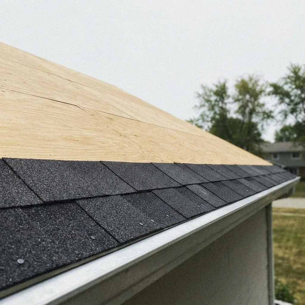
A color blend is not one flat shade. Manufacturers mix several granule colors on a single shingle so the roof reads with depth instead of looking painted flat. That mix produces what's called a shadow band, a darker striping effect built into the shingle pattern that repeats across the roof. Two blends can look nearly identical in a small photo yet read completely differently once shadow banding shows up across a full slope.
Tying In Siding and Trim
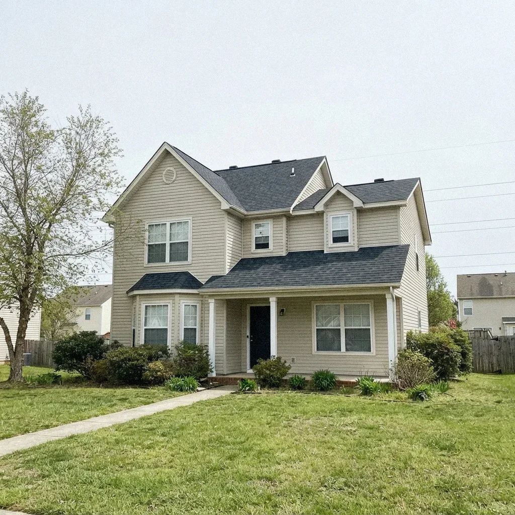
Trim and fascia color often gets picked last, but it works as the visual bridge between roof and siding. A shingle blend that clashes with the stone can sometimes still work if the fascia carries a tone that ties the two together. Homeowners in Wood Ranch or Bridle Path dealing with wood trim against stucco siding have a harder bridge to build than a house with vinyl trim and a plainer wall.
Choosing a Contrast Level
Beyond warm or cool, there's the separate question of how much the roof should stand out. A monochromatic scheme keeps shingle, trim, and siding close in value, so the eye barely notices where one surface ends and the next begins. A high-contrast approach lets a dark roof sit deliberately against a light wall, or the reverse. Neither is right or wrong; it depends on whether the house is meant to blend into the block or stand apart from it.
Why Showroom Swatches Deceive
A shingle sample card in a showroom is a few inches of granules seen under fluorescent light, held close to the eye. The same blend on an actual roof gets viewed from thirty feet away, in direct Simi Valley sun that shifts from morning to the flat glare of afternoon. Colors that look balanced side by side on a card can separate or wash out entirely once spread across a real slope facing the street.
Reading a Full-Size Sample
A full-size sample board solves that gap. Instead of a swatch, it's several complete shingles laid out together so the shadow band and granule mix show at actual scale. Some suppliers will provide boards large enough to prop against a wall or fence rather than hand over a brochure chip. Seeing the blend at this size is the only reliable way to judge how it will actually sit on the roofline once installed.
Checking Color Outdoors
A mock-up viewing means taking that sample board outside and holding it against the house itself, not judging it indoors under a kitchen light. Check it in the morning and again in the afternoon, since Simi Valley's sun angle changes the way granules catch light through the day. A blend that looks right at 9 a.m. can shift noticeably by 3 p.m., especially on south- or west-facing slopes that take the harder glare.
Watching for Dye Lot Shifts
Granules are a manufactured product and batches vary slightly. On most jobs it never shows, because the whole roof comes from a single production run. It shows when a job gets split: one section done now and another next year, or a repair drawn from stock ordered separately. The shift is usually subtle and often only visible in certain light, but across a large uninterrupted slope it can read as a faint band. Asking for the material to come from one lot, and getting that written on the order, is the whole of the prevention.
Getting the Ridge Cap Right
The ridge is the line the eye follows, so getting the cap wrong shows more than any other color decision. Cap shingles come in matched blends for a reason: field shingles cut up and used as cap read as a slightly different color and a slightly different texture right along the top of the roof. The other half of it is profile. A high-profile cap throws a deeper shadow and gives the ridge a defined edge, while a low-profile one nearly disappears. Neither is wrong, but it is worth choosing rather than inheriting.
Judging the Curb View
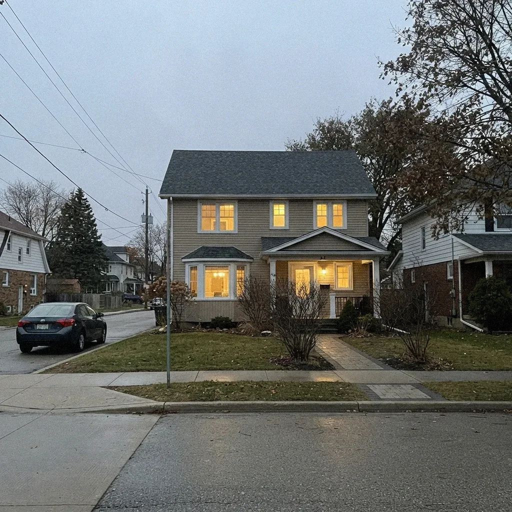
The curb view is what actually matters in the end: how the roof reads from the sidewalk or the street, not from a ladder six feet away. Sample boards, mock-up viewings, and undertone checks all exist to predict that view before shingles go on permanently. Walking the block and looking at the house from where a visitor would first see it, rather than up close, is the final check before committing to a blend.
Dealing with this in your home?
Simi Valley roofs face a different clock than shaded lots elsewhere. Tract homes off Erringer Road and near Rancho Simi Community Park sit exposed under direct sun for decades, with Santa Ana winds testing every loose tile between First Street and the Santa Susana foothills. Red flag warning days push that timeline faster than most homeowners expect.